
Anyone can edit photos like a pro with any software
Subscribe
Edit Photos Like a Pro
Once you complete this photo editing tutorial, you can easily edit images like these since I will share everything you need to know to get these pro results.
Plus, if you stay to the end, I’ll share my favorite editing tool, which can transform your skies from ordinary to extraordinary, like these if we’ve never met.
So, let’s jump into my editing software of choice, Lightroom Classic.
Again, if you’re not using Lightroom, that’s okay because your editing software has the same editing tools I’m sharing today.
If yours doesn’t, I’d be surprised to hear that.
So, let me know in the comments what photo editing software you use and what missing tool you need. I can probably find it for you since sometimes it might have a different name.
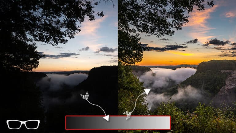
Alright, here’s the image that I’m going to be working on. As you can see, it’s extremely underexposed.
We can see that visually and also in the histogram because we have a huge gap on the right, which is an indication of underexposure.
I did this purposefully because I wanted to expose the sky to ensure that I created or captured all the details without losing any of the sky’s colors or details.
That also created significant underexposure for our subject in the foreground and the middle ground here, so we need to fix that.
Now, once you jump into your editing software of choice, you can often get overwhelmed by all the different editing options available.
So, the place to start is up here at the top with your tonal values. You can increase your shadows to bring out the detail in that part of the tonal range.
You can adjust the highlights to recover the details in the highlights, such as the sky.
The whites will make everything brighter, the blacks darker, and the exposure will adjust the brightness level of the midtones.
If we look at our histogram now, we can see that its shape has changed, and we’ve now filled in the histogram, or the information from blacks to whites has been completely filled in.
If I reset this, you can see again how that histogram looked originally without any edits.
Now, if you have this option, most software does have this option.
I recommend starting with an AI feature.
Like in Lightroom, we have an auto that uses artificial intelligence to automagically edit the photo and adjust the tones according to its technology.
Then again, we can see that the histogram is very similar to what I had when I made my adjustments, but my exposure was lower.
I may want to bring the exposure down or adjust some of these other sliders based on my preference.
This image is much better but looks nothing like the final edit.
This is amazing.
This is a beginner’s type of edit. Where do we go from here to here?
Well, we have to target different parts of the image to apply these tonal adjustments, getting that detail in the shadows, the highlights to bring out the colors, and everything else.
So, this is not a sky replacement in Photoshop.
It came from the original file, and the colors and the details are there.
We just had to choose the correct editing tools to bring out those details. The color is natural; this is the natural color at this time of day: the blue hour.
So, the light will be blue to purple during the blue hour, and it might be slightly warmer depending on how close you are to the golden hour.
This might be a few minutes after golden hour, which is why I still have some warmth in the overall image.
The pigment of the rocks also takes on these blue, pink, and purple tones based on the color of light being displayed on them at the time of capture.
I didn’t make any Hue adjustments to change the colors in the image.
This is a natural color captured at the time of creating this image.
So how did I do that?
Well, as I mentioned, you have to target different parts of the image. You can do that by creating new layers, targeting different parts with layer masks, or doing what is known as dodging and burning.
I am so, making parts of the image brighter or darker.
But most editing software nowadays has these tools built in without having to use layers like in Photoshop or Photoshop Elements, or even GIMP.
If we click on this masking icon here, I can select the sky; Lightroom will automagically detect that sky and then make a mask out of it.
If we click right here on this red box, I like to change the color of my mask when that color, which is this color by default, is similar to the colors in my scene.
In this instance, I have blues, purples, reds, and things like that.
It’s hard to see that overlay.
I may choose a green color and then change the opacity to see where that mask was applied. Now, it’s not 100% perfect.
We can see some masking on this subject, this monolith, or this ridge.
We can subtract from that mask with a brush.
Now, it’s not going to make a huge difference on my subject, but what I’m going to do is invert my mask. Because those edits are being applied in the sky a little bit, once it’s inverted, it’s going to create a ghosting effect.
So it’s going to look like a halo around your subject.
Let’s leave it like that, and I’ll show you what that looks like once we get to that part of the editing.
Now, I typically like to do my skies first, but we’re going to do that last.
I will go ahead and right-click, select, duplicate, and invert my mask.
Any editing software nowadays should be able to do this quickly and easily.
I will go ahead and change the mask opacity here to be a bit lower.
Then, I can apply edits to my tonal range on this part of the image.
So, let’s go ahead and do that.
Let’s also turn off the show overlay so we can see what we’re doing as we edit. It’s very, very dark right now.
I could increase the exposure, but look how flat that is down.
There’s a little contrast in that part of the image now.
So I will go ahead and undo that with commander control plus the letter Z to undo that.
Or you can double-click right here and that will reset it.
So, what I want to do is target the white tonal value.
So, if we look at our histogram here, we have exposure to black shadows, which is the midtone, highlights, and whites.
This white slider will target the pixels in this part of the tonal range, and I want them to be brighter.
I will increase this a lot to brighten up that monolith.
And I think I will go right about there and then maybe darken it up just a bit with the blacks to maybe around minus eight to minus ten or something like that. Now it’s still too dark.
I want to return to my tonal values here and make some adjustments.
I will increase my exposure to about one and a half stops.
I will reset the contrast slider here because I like to apply my contrast with the presence and/or the tone curve.
And I’ll show you how these texture clarity and Dehaze sliders add contrast in a moment.
I also want to reset my highlights, and you’ll notice that as soon as I do, the overall image gets brighter. So there we go.
It’s much brighter, and there are fewer highlights in this part of the image.
So, I don’t need to recover the highlights there, but I will need to apply more highlights in the sky to bring out those details.
If I bring my highlights all the way to minus 100, you’ll notice this part of the image gets darker.
It was subtle but darker, so we wanted to target different parts of our image to ensure we got the correct tonal value for each part.
My shadows are a little bit too bright, so I’m going to bring that down.
I’m also going to bring my whites down just a little bit, and I think my blacks are way too dark.
So I will come down to around minus 30 to minus 32.
So maybe right around there. Then, I’m going to increase the haze to add just a touch of contrast to the entire image.
Let’s go back into our masks and target other parts of the image now.
So, I think I want to increase the Dehaze for this part of the image.
Just a tad more contrast. Let’s compare the before and after.
You can definitely see the highlights in the shadows are much more defined than they were before, and it’s a little bit brighter and has more contrast, and that’s just based on those three edits.
So, let’s talk about the effects panel here quickly for texture, clarity, and Dehaze.
What they are doing is targeting different parts of the image in terms of the size of the detail, and it’s adding contrast to the edges of those details, which also gives the impression of sharpening.
So the texture is going to target smaller details, clarity a little bit larger, and then DeHaze is going to target larger details.
It’s going to have the biggest effect in terms of the amount of contrast that is going to be visible in your scene.
It’s a lot more dramatic with the haze versus clarity and texture, depending on how many of those details are visible in your scene in terms of their size.
Now I have some images from Antelope Canyon, in which Clarity did a better job of providing sharpness and contrast than Dehaze and texture.
So it all depends on the subject matter and the amount of details or the size of those details for that subject.
So, typically, I like to add a little bit of clarity and texture, but I think Dehaze alone provides enough contrast for this image.
If you go too far, you’ll add too much contrast, which will look unnatural.
So I’m going to go back to plus 10.
Now, before we get to the sky, which will have the most dramatic effect once we’re done, I want to create a gradient for the foreground here because I find this part of the image down here too bright.
I’m going to find my linear gradient tool here and create a mask.
I’m going to go ahead and reverse this here.
This will allow me to create a gradient of darkness from dark to no edit from the top or from the bottom to the top.
And that will allow me to target my edit right to that gradient mask.
So, I will lower the exposure here to around minus three-quarters of a stop.
So, it looks pretty good right there, but I think I need to make one more targeted adjustment to our primary subject in the foreground.
I don’t want to select this part of the image.
So, we’ll use a brush to create a mask for this part of the image.
If you have an auto mask option, turn it on.
It will determine the edge of your subject and the other side of it, and it will allow you to keep that mask within that line or separated from the foreground and the background.
Now, again, it’s not 100% perfect.
You’ll have to create a new brush to subtract or add to it as needed. So you can see that it’s not perfect.
So now I need to zoom in and go around it to fill that mask.
As you can see, I went outside the line, and it’s starting to select this ridge back here.
So I will hold down my alt or option key to get the erase tool, and then I can subtract from the mask.
If your editing software doesn’t have this option, you’ll have to select the erase brush separately, and then you can subtract it from the mask.
So, in Lightroom, we have a subtract option here or an add option, and then you can choose your adjustment method that way.
Now that I have that selected, I can target my edits just to this ridge here.
And because I’m still finding the subject to be too dark, I will slightly increase the exposure.
I’m going to increase the whites, which will, automagically, make it brighter.
I think I’m going to go all the way to plus 100. Then, I’m going to darken the blacks just a little bit, which also adds a little bit of contrast.
I need to make this a tad brighter. Let’s go ahead and set it right there.
Alright, we’re almost done. The last step is to make adjustments to the sky.
As you can see, it’s really flat, so we need to add a little bit of contrast. That should add some pop and magic to the sky so that those colors really come out more than they are right now.
It looks like it’s also underexposed.
Before we do that, I want to warm up the overall image just a bit.
It looks a little bit too cold, even though it is a little bit cooler at this time of day.
I like my images a bit warmer, so I’m going back to my tonal values and adjusting my temperature.
So maybe right around 6,000 or maybe more.
Right around 6,300 looks pretty good, and maybe just a little bit on the tint.
Alright, now let’s go back and make our adjustments to the sky.
Overall, we need to lower the exposure, one to a half stops.
I will go ahead and adjust this to see what I like.
So maybe I think it looks pretty good right around one and a quarter stops.
We will bring back some detail in those clouds by adjusting the highlights here to the left.
So that’s going to make those clouds in the skies even darker.
The further I go with highlights, we can see it’s much darker here at minus 100 versus minus 50, but this is too much.
Once we add some contrast here, it will define the clouds, separate them from the sky, and make everything darker, richer, and much more colorful.
And my favorite editing tool for making skies pop is the haze.
Once we adjust this to the right, you will notice a huge transformation in the clouds.
How cool is that? I love it.
I’m also going to adjust the saturation just slightly to bring out more colors in the sky, but we have one problem.
Not sure if you can see it, but if we zoom in here, it might be easier to see.
And this is a huge mistake many beginners need to correct when editing their photos. There’s a halo effect going on here.
And remember, I previously mentioned that if we invert that mask, it’s going to bleed into the sky as well.
Let’s see if we can find it here.
Did I already remove it all? I don’t think I did. Let’s check this side.
We can see it right there, and it’s also in this part of the image.
I’m going to go ahead and subtract with the brush. I’m going to turn on the overlay so I can see that better. It’s not showing up, but it is because a slight halo is going around the image.
I will erase all of this to get rid of it.
Now, it’s really subtle. There’s not a lot there, but it’s enough to create a little bit of a halo, and you’re probably not seeing it on your monitor with the video compression and everything.
It shows a different number of pixels or resolution and the same quality I’m seeing you probably not seeing on your end.
But you want to be aware of that when editing your images to ensure that you don’t get that halo effect.