Saturation vs Vibrance | Which One For Better Results?
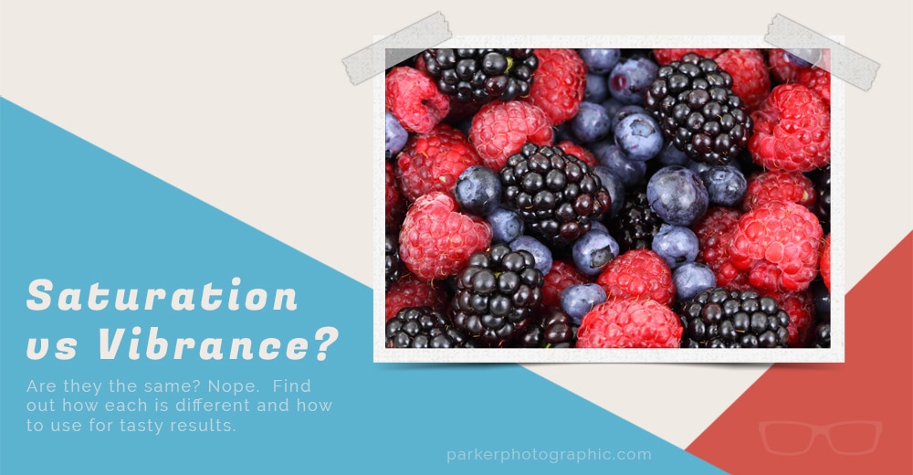
Saturation and Vibrance are two editing tools you’ll come across as you edit colors in your favorite digital program.

Both will affect the intensity of your colors differently. Knowing how each works will help you decide which one to use, how much, or if at all.

Both sliders are available in all the popular editing software like Photoshop, Adobe Camera Raw, Lightroom, GIMP, Affinity Photos, and others.

Ready to discover the difference between the two? Awesome… let’s get started!
Table of Contents
Saturation vs Vibrance… the Differences
Both options have their own individual slider. Each provides a different creative outcome.

Which one you use will depend on your creative vision for the shot. Plus, your photography genre may play a role in your selections too.
Each slider has the same scale. By default, both start off at zero. To the right increases the intensity of the colors and stops at a maximum of +100. To the left, the colors are decreased and have a maximum of -100.

When it comes to applying the edits, you are in affect targeting all the pixels of the image. In other words, these are global edits.

If you want more precision and control of where the edit is applied, you have a couple of options. In Lightroom and Photoshop Camera Raw, you can apply Adjustment Brushes to paint on the edit exactly where you want it.

In Photoshop and GIMP, you can use a layer mask to remove the edit from areas of the photo where it shouldn’t be applied.
Saturation
When it comes to the Saturation slider, it will affect all the colors in the entire tonal range of that image. Everything from the Blacks, Shadows, Midtones, Highlights, and Whites will be affected. This will create some gnarly, cartoon-like effects if over-done.

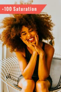
For example, the second image was maxed out at +100 via the Saturation slider.

Notice the color intensity from maxing out the Saturation. The skin tones are too orange and unnatural. Unless your artistic vision requires this much Saturation, there isn’t a need to apply this much… ever.
Photo and original edit by Guilherme Almeida
Now, check out what happens when the Saturation is dropped to -100. This removes the colors from the entire tonal range and leaves you with a B&W image.

This is a quick and easy way to convert your color photos to B&W. However, it's not the best method. Instead, you should convert your image to a Monochrome profile in Lightroom or ACR.

This gives you more control over each individual color channel for better results.
Vibrance
The Vibrance slider also affects the intensity of colors. However, instead of targeting the entire tonal range, it focuses more on the Mid-tones.

I’ll spare you the dull, scientific algorithm used to target these colors. That being said, as you adjust the Vibrance slider, you’ll notice the colors of the Histogram begin to stretch and peak within different tones.

So, although it’s mainly targeting Mid-tones, it can also affect other tones, but at a smaller amount compared to Saturation. Think of Vibrance as changing muted colors or the softer tones.

Maxing the Vibrance slider out at +100 isn’t going to give you good results. But, it’s less intense compared to the Saturation slider.

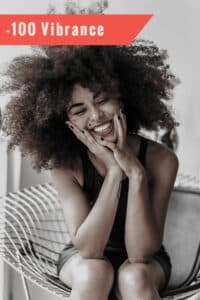
Something interesting happens when you drop Vibrance to -100. Unlike with Saturation, you are not left with a B&W image. There’s still color visible… mostly in the Midtones.
Vibrance vs Saturation For Best Results
The best way to learn what Saturation and Vibrance do is to play with each slider with your own image.

Once you have an idea of how each affects your pictures, you might wonder how to apply for the best results.
Art, like photography and editing, is subjective. I have a specific style that I use on my images. You may or may not agree with those edits. Which is fine. You have to discover your own style.

The next few images will give you some ideas on how to use both the Saturation and Vibrance for the best colors. Take these tips + settings, and tweak for your personal preference.
Saturation + Vibrance For Portraits
When it comes to editing portraits and adjusting the colors, I tend to err on the side of caution. There's an old saying, “Less is more.”

Rarely will I touch the Saturation slider to boost the color intensities. Doing so often leads to unnatural looking skin tones.

At times, I'll lower the Saturation to tone down the colors of the entire image. How much depends on the creative effect I'm after for a particular image, anywhere from -10 to -50.

I'm a little more lenient with the Vibrance slider since it's affecting mostly the Midtones.
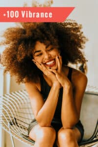
However, if you boost it too much, it can still change skin tones unnaturally (as shown in the image above).

Although, sometimes you’ll notice that you can increase the Vibrance more with one photo vs another without affecting the skin tones as much.

This will depend on the color profile, and the overall colors captured.

Again, depending on the photos, I’ll increase Vibrance from +5 to +25. I love the effect of removing Vibrance, and I’ll lower it anywhere from -10 to -100.
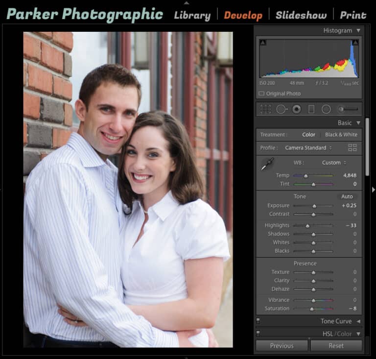
For this image I decided to reduce the Saturation to -8. The color profile already saturated some of the colors and I found it was a bit too intense. For portraits, I rarely boost Vibrance and or Saturation.
Vibrance vs Saturation For Landscapes
When it comes to landscapes, I’m more likely to make adjustments with both Saturation and Vibrance.

How much all depends on the image. I wish I could give you formulas for using “x” amount for this and that, but it’s not that easy. Every landscape is different… the lighting, colors of the scene, textures, and more.

For the Saturation slider, I’ll boost it anywhere from 0 to +20 or reduce by up to -20. The same is true of the Vibrance slider.
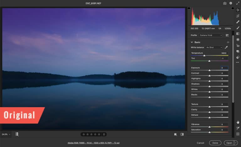
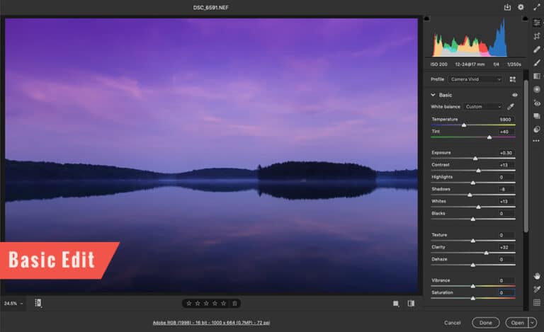
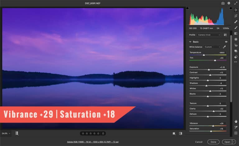
Click to enlarge each for a better view and to look at my settings too. For this edit, I broke my standard settings to enhance the colors. This was shot during the Blue Hour. My vision for the shot was to accentuate the purples and blues.

Vibrance and Saturation allowed me to achieve my goal. Is it too much? Some will say yes. Some will say they like one of the other two. But, all that matters is what I like. You’ll have to edit your images based on your personal preference.
Saturation + Vibrance For a Retro Style
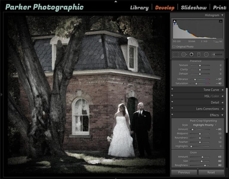
My favorite technique for creating a retro style is to reduce Saturation and or Vibrance. Instantly give your photos an old-school, antique finish by dropping Vibrance to -100.

Most of the time, I'll use a combination of both to lower the color intensities for a retro effect.
Boost Color Intensities Without Vibrance and Saturation?
Vibrance and Saturation are not the only tools available for adjusting the intensity of colors. There are several different ways to boost colors In Lightroom and Camera Raw.
HSL - this tool stands for Hue, Saturation, and Luminance. Each option gives you another way to boost saturation, brightness, and more. With this tool you can target individual color channels for better control.

For example, if you want to boost the Saturation of only the blue colors you can achieve this with HSL.

Tint - did you notice I boosted the Tint to +40 in the landscape photo above? This helped enhance the purples in the image.

Contrast - as you adjust the contrast slider or by using the Tone Curve you’ll notice the color saturation will increase too.

So, the next question is when should you apply the Vibrance and or Saturation edits… or at all?

For quick edits, I’ll use the Vibrance and Saturation sliders after making necessary adjustments via the sliders above these two in the Basic Panel.

For custom edits, I’ll skip these two sliders all together. Instead, I’ll use the HSL panel and or Adjustment Brushes to control the color Saturations.
What Now?
Adjusting the Vibrance vs. Saturation sliders is going to require some practice with your own images. Only then will you be able to decide what is best for you.

Next, you may want to learn about the differences between Clarity and Texture sliders. Each affects your images differently, just like with Saturation and Vibrance.


