
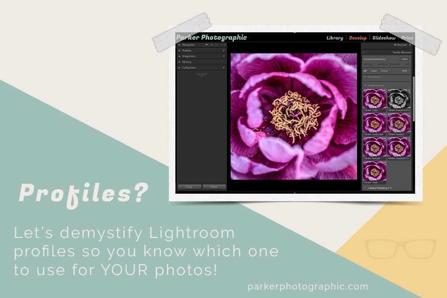
Discover What Adobe Lightroom Profiles Are & Which One To Use For Your Images
Whether you’re using Lightroom Classic CC or Lightroom CC, both give you control over which profile to use for your RAW files.
But, the question is... what is a Lightroom profile?
In photography and digital imaging, the term “profile” means many different things. There are color profiles, working profiles, printer profiles, and many more.
In Lightroom and Adobe Camera Raw (ACR), a profile is used to interpret your RAW file into the colors and tones that you see. That interpretation was created by someone that says the colors of your RAW image should look like “x,” and it should have an “x” amount of contrast.
In a way, profiles are like Lightroom presets. They both have editing information saved to it and will adjust your images based on those edit settings. Both profiles and presets are non-destructive too. The difference between the two is you can change the edits applied via presets but not with profiles.
Think of profiles as a starting point for your editing. Based on the profile, it applies a certain amount of contrast, color saturation, and tonal adjustments.
Adobe has its own set of profiles for Lightroom and ACR. To make matters more confusing, your camera manufacturer has more profiles to choose from! No worries…
…this article is going to de-mystify Lightroom and camera profiles, so you know which one to use for YOUR images.
Oh, and if you were or are a film photographer, you use profiles too! More on that coming up soon.
Table of Contents
PER ADOBE:
“Our profiles incorporate deep imaging science and take into consideration the colors of the filters used on top of the sensors (the array of red, green, and blue filters that help an otherwise colorblind sensor “see” the colorful world around us), the specific sensitivity of the sensor used, the sensor’s characteristics in different lighting conditions and with different ISO values to interpret the digital 1s and 0s into images inside Adobe photography products.”
That’s a mouthful! Basically, Adobe is saying they have developed profiles to give you a starting point for your editing.
Use one of them to add a certain amount of contrast and color saturation based on your personal preference.
Not All Profiles Are Created Equal & Film Photographers Use Profiles Too!
Nikon, Canon, Fuji, Sony, etc.… which DSLR or Mirrorless camera is better?
What if I told you it doesn’t matter and they are all the same? They pretty much are. At least in regards to how the camera works, collects data, and the resolution. Give or take a few pixels here and there.
The real difference between all camera manufacturers is how they interpret color… or the profiles they’ve created!
Have you ever seen a photo and thought…
“Wow, I love the colors and the tones of that image.”
You then see other images with the same quality tones. You suddenly realize all the photos came from Nikon. Or Canon. Or Sony.
You fell in love with the color interpretation of that camera profile! That is the camera for you.
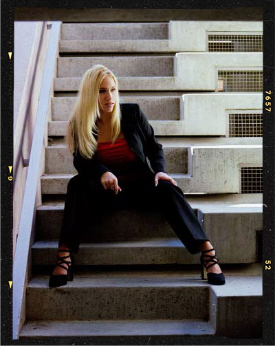
Circ. 1990. Nikon 8008 | 50mm | f/5.6 | Kodak Portra ISO 400
Personally, I preferred the color tones of Fuji film for almost everything. However, for portrait and wedding clients, the color negative of choice was Kodak Portra.
Digital + Film Photographers
Digital camera profiles and software profiles are just like film!
What was/is your favorite kind of film? Fuji, Kodak, Ilford, Agfa, or something else? Color Slides or Color Negatives?
Each manufacturer has their own color “profiles” for their film. In other words, they have a specific color tone + saturation and contrast that you can choose as a starting point for your editing.
However, profiles for film like JPEG files can not be changed after the fact.
Intended Purpose of the Profile
…the red, green, and blue filters over the sensor will capture the different colors.
Then, these colors are mixed together and recorded as individual color pixels that, when placed side-by-side with others, begin to create the contrast and textures of your photo.
It is not the camera sensors’ job to interpret what the colors should actually look like. It’s not possible since a camera can not see colors as we do. Your digital camera sees colors as 1’s and 0’s.
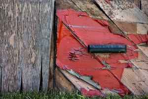
Check out the first image below… it’s very flat. No contrast and the colors are subdued.
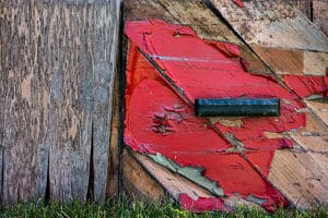
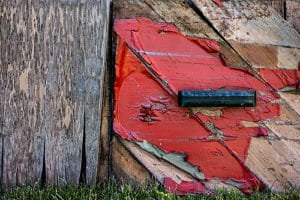
The next two images received two different profiles. Notice how the color saturation and contrast are distinct from one profile to another.
So, the purpose of a profile is to give you a starting point with your editing. You can choose a profile that matches your creative editing style, or based on the genre of photography.
You can also select a neutral profile, with little to no editing (subdued colors and flat contrast). Hence, this gives you full creative control over the edit.
Note: If you shoot in JPEG, the profile used is permanent. RAW shooters can change the profile with Lightroom, ACR, or other editing software that supports profiles.
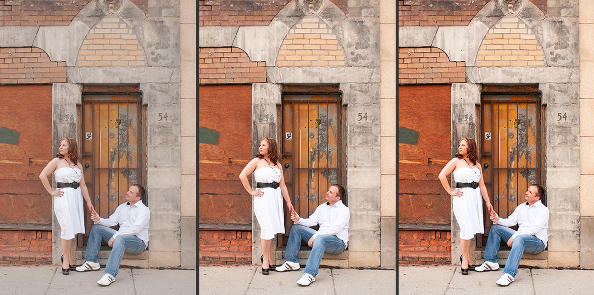
The first image is using the Adobe Neutral profile. The second is Adobe Color and the third is Adobe Vivid.
Note: no other editing has been applied. Click to enlarge
3 Lightroom Profile Sources
When it comes to Lightroom profiles, you have 3 primary sources. This includes profiles provided by Adobe, your camera manufacturer, and third party creators.
Let’s explore these different profile options.
7 Adobe Lightroom Profiles For RAW
As of this writing, Lightroom (and ACR) has 7 profiles to choose from.
Keep in mind you’ll only be able to apply these profiles to RAW images. JPEG files already have a specific camera profile embedded, and it can’t be changed.
Let’s look at each so you can decide which is best for your photos.
The following images are low-res and might be difficult to notice the difference between each profile applied.
Download this image (no email required), import into Lightroom and compare each Adobe profile.
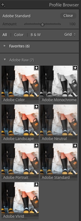
Adobe Neutral
This profile is the closest to “raw” vs. the others. It adds very little (if any) additional contrast or color saturation.
Overall the image is flat. If you want total control over editing your picture, this is the profile for you.

Adobe Standard
This was the original default profile when Lightroom first shipped in 2007. In fact, there were no other profiles to choose from! Unless, of course, you used one of your camera manufacturer profiles.
Over the years, this profile has been tweaked and recently has been updated to v2. Compared to Neutral, this profile is a bit more contrasty, and the colors are more saturated.

A slight boost vs. Neutral. It might be hard to compare these low res images so I recommend checking out each Lightroom profile with your own photos to see the affects of each.
Adobe Color
This color profile is a culmination of years of feedback from photographers and a spin-off of the standard Lightroom profile.
It was designed to closely match the original colors and tones in the scene at the time of capture.
It has a small increase in contrast and is a bit warmer in the reds, yellows, and oranges vs. standard. Also, the skin tone renditions are much improved.
This Lightroom profile is intended for a wide range of photos from portraits, to landscapes, to product photography, and much more.
Adobe Landscape
This profile was designed for, well, landscape photographers. The colors are more saturated, and it enhances blues and greens.
You’ll also notice a small boost to the overall contrast of your image.
Notice how much more vibrant the red is vs the other profiles? The contrast is also deeper. Oh, and the yellow and green tones are more saturated too.
Adobe Portrait
Guess what genre of photography this one was created for? Yep, portraits.
It provides the best (in my opinion) interpretation of skin tones. Plus, the overall contrast is more pleasing for people.

Adobe Vivid
Vivid adds a lot of vibrance and contrast to your images. But, the skin tones are surprisingly still natural (in most cases). This one might be ideal for people and or landscapes.
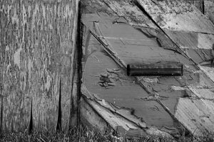
Adobe Monochrome
When you change the “Treatment” from color to black and white, the profile is switched to Monochrome. Monochrome is different from b&w, though, and is definitely not the same as adjusting saturation to zero.
When applying this profile, the colors shift slightly when converted to grayscale. You’ll notice that warmer tones are brighter, and cooler colors are darker. This adds contrast to the image that can’t be obtained with a basic b&w conversion with saturation.
Using the Monochrome option is the best way to go for converting and editing black and white images.
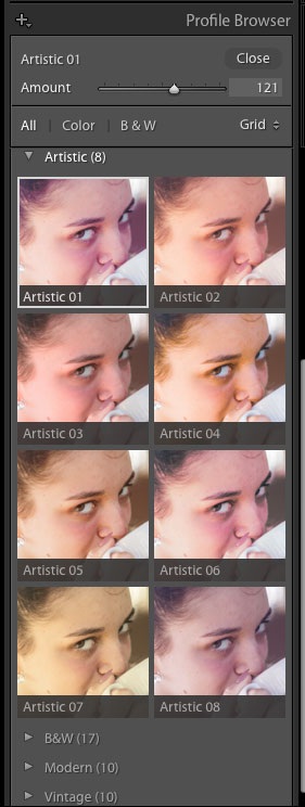
Adobe Creative Lightroom Profiles For RAW Or JPEG
The next set of profiles is more stylistic vs. the previous profiles. You’ll find the color shifts are more dramatic vs. the first seven. Plus, these can be applied to JPG images too!
Another cool thing about these creative renditions is the ability to adjust the opacity of the profiles! In the Profile Browser, an Amount slider is positioned at the top for controlling the opacity.
There are three types of creative profiles; Artistic, Modern, and Vintage. Instead of writing about what each one does, it would be best to try them out for yourself!
Camera Matching Profiles
When it comes to editing, I believe that editing starts in-camera and not in Lightroom!
Since your camera manufacturer has profiles too, this should be one of your first selections.
But, the question is which one should you choose?
For my Nikon Z6, there are 11 profiles to choose from! 6 color and 5 monochromes. The color options have been named based on possible uses. Depending on your camera, the matching profiles might be similar to these…
Flat – minimal saturation and contrast. This is similar to Adobe’s Neutral profile. It’s the closest to “raw” you can get and gives you the most creative control.
Landscape – saturation is more vibrant, and contrast is bold. For my Nikon, it has the most vibrant saturation and strongest contrast.
Neutral – built on the flat profile and has a bit of saturation and contrast.
Portrait – designed for pleasing skin tones.
Standard – more saturation and contrast vs. Neutral + Portrait.
Vivid – more contrast and saturation vs. the previous two.
Now, it’s your turn to fire up Lightroom and go through each camera matching profile to see how each affects your images.
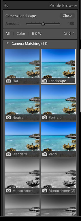
Pro Tip 1: Adobe doesn’t use the exact profiles created by your camera makers. Instead, they have created Lightroom profiles that closely match those profiles.
If you’re concerned about accuracy, you can always use the included (free) editing software provided by your camera manufacturer!
Pro Tip 2: During import, Lightroom reads the metadata of your RAW file and uses the corresponding profile you selected in-camera.
If you choose the wrong one or forget to or prefer a specific Adobe profile, you’ll need to make that selection in post-production. This should be one of your first steps!
Third-Party Profiles
These profiles are creative by other artists. You could even create your own. However, Photoshop is required to save the profiles for use in ACR and or Lightroom.
Here’s one of my portrait profiles you can download and use for free.
An old-school, retro-style created with my custom Portrait Profile.
What Now?
Great question!
Keep in mind that all profiles are the starting point for your edits. Feel free to experiment and change them at any time.
Also, remember editing starts in-camera, and you should choose the appropriate profile before shooting.
What if you prefer the Adobe Lightroom profile vs. your camera matching options?
In that case, you’ll need to remember to make the profile change during your editing workflow. Or, better yet, create an import preset with your favorite profile to be applied during import!
The last question now is which profile should you use?
Well, that’s entirely up to you and your personal preference in how you want your images edited. Or how you want the colors and contrast to be interpreted based on your creative vision.