THIS will change how you edit your photos…
FOREVER
Subscribe
This one concept will change how you edit your photos FOREVER.
Although fundamental to photography, this concept is rarely discussed in the photographic community regarding photo editing.
And, until you master it, editing your photos can be a challenge.
But, in this video, I’ll reveal this “one” concept, how it affects your images, and how to use it to improve your images in any photo editing app.
In fact, if you watch one hundred percent of this video, I guarantee photo editing will be easier, and you’ll improve your images.
ONE CONCEPT
So, what is this one concept?
Light
I know it’s not earth-shattering. But if you don’t understand how you and your camera see the light differently, editing an image will be a greater challenge than needed.
Everything you need to know about how to edit your image starts with Light.
For example, let’s look at some Basic edits you can do in Lightroom and about every other photo editing app on the market.
So, in the Basic section, we have a category of edits known as “Tone.” This includes your Exposure, Contrast, Highlights, Shadows, Whites, and Blacks.
These same edits are available in popular photo editing apps like On One, Luminar Neo, Affinity Photo, etc.
But what is a Tone? What happens when you adjust the Tones? Which ones should you adjust? All of them are only one or two, and why?
And more importantly, how much should you adjust them? Should you do plus fifty or eighty-five, or plus or minus one hundred?
I will give you some Pro Tips on which of the Tones you should adjust and when, why, and how much in just a moment.
First, let’s dig a little deeper into Light and how it relates to Tones.
LIGHT
In essence, Photographic Light refers to how a light source illuminates the scene and subjects.
The intensity of the light can vary throughout a scene and the time of day.
In nature, the various intensities of Light are infinite and are known as the Dynamic Range, which is similar but different from Tones or the Tonal Range.
But, as mortal humans, our eyes can only see twenty-one levels or various intensities of light at one time.
These levels are known as Stops or Stops of light.
Now, if you’re wondering what this has to do with photo editing, well, everything, and just give me a few more moments to explain, and you’ll see how this will improve your photo editing.
I should also point out that this is the bare fundamentals of light and I go into greater detail about it in my free photography course that I’ve linked to in the description.
Ok, so your camera is even more limited than your eyes. Depending on your camera, it can capture seven to fourteen stops of light.
The intensity levels that it captures are known as the Tonal Range.
Within that Tonal Range, we can divide the Stops of Light into five categories, the same ones I mentioned previously.
EXPOSURE
Ok, so once you create an image, you have what’s known as an Exposure.
Exposure is how bright or dark your image is.
PHOTO EDITING APP
Then, in your photo editing app, you can make your Tones brighter or darker to shape the Light intensity based on your creative vision.
The most difficult part of editing your Tones is figuring out which ones to adjust since you don’t always need to adjust all of them, and then you have to decide how much of an adjustment.
PRO TIPS
So, here are some pro tips for editing your Tones.
Depending on your photo editing software, you may have one or more different tools to make it easier to utilize these Tone adjustments.
However, all have one tool that rules above them all since it gives you a graphical representation of your Tones, and it’s known as your Histogram.
HISTOGRAM
As I hover over the Histogram, you’ll see each section of the Tones is highlighted with a light grey box, and the name of that Tone is listed right here.
So, on the left, we have the Black Tones, followed by the Shadows, Exposure or Midtones, Highlights, and Whites.
Now, the graph is plotting how many pixels for that level of light intensity is visible inside your image.
And this creates the Peaks and Valley’s visible in your Histogram.
On the left side, the Peak in the Blacks is taller than all other Tones. So this tells us that there are a lot of pixels that represent detail in that part of the Tonal Range.
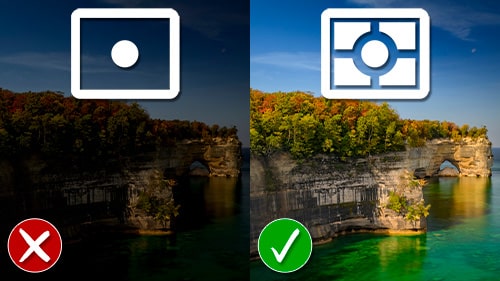
Based on that information, we should be able to brighten the Blacks and Shadows to reveal the details in that part of the image, which would be the lower two-thirds of this image that I captured at Letchworth State Park in New York.
So, let’s try it. Alright, those two adjustments revealed the trees and the Genessee river that were difficult to see before.
But, the image doesn’t look all that great, does it?
CAUSE AND EFFECT
There’s one fundamental thing you should know about these Tone Adjustments: the amount of Contrast is altered the more of the edit you apply.
Which is why we have a Contrast adjustment slider to add or decrease the amount of contrast based on the Tone adjustments.
So, these two adjustments reduced the contrast and the image is now flat.
So, if I increase this to right to add more contrast, that adds just enough back into the image based on my personal preference.
Overall though, it’s still a little flat and underexposed.
My next option is to adjust either the Whites and/or the Midtones or the Exposure.
If you’re unsure which one to use, let your Histogram tell you.
For this image, there isn’t any peaks or valleys of information in the Whites. And, there’s a little gap.
In most instances, depending on the light in the scene and your creative vision, you may want to have detail in every tonal range from Blacks to Whites.
Since there’s little to know values of light in the Whites, I’m going to fix that by increasing the Whites.
But, if I go too far, I begin blowing out the highlights or in other words lose detail in that Tonal Range.
Depending on your software there should be a Clipping Mask button that will provide a color overlay if you’re over exposing a tonal range and another color for under exposing.
Now, by increasing the Whites the side-effect is an increase in contrast. So, I may need to reduce my Contrast to counter that.
Also, I can add more contrast by reducing the Blacks.
So, I’d recommend adding additional contrast last.
IS IT CORRECT?
Now that I’ve edited the images with the Tones, am I happy with the results. Actually, I’m not since this isn’t my photographic style or the way I edit.


